Sharing helps us build more free tools
Spline graphs are line graphs where the line has been smoothed. The smoothing is useful for showing that the relationship between x and y is smooth and not jagged, as the points might suggest.
The spline chart below shows the relationship between the car model and miles per gallon.
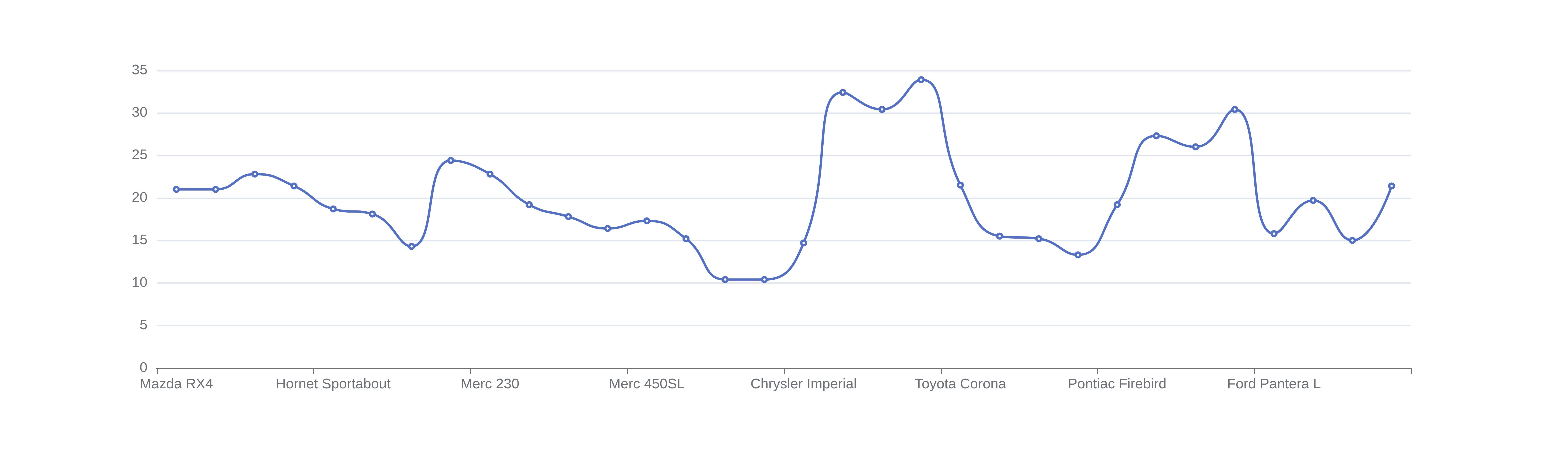
The smoothing is not based on statistics. It is just there as a visual aid. To quantify the relationship between the variables in your data, you can perform a regression analysis.
When To Use a Spline Graph
Use a spline chart to show the relationship between two numeric variables, where at least one is numeric. The independent variable should go on the horizontal x-axis, and the dependent variable should go on the vertical y-axis.
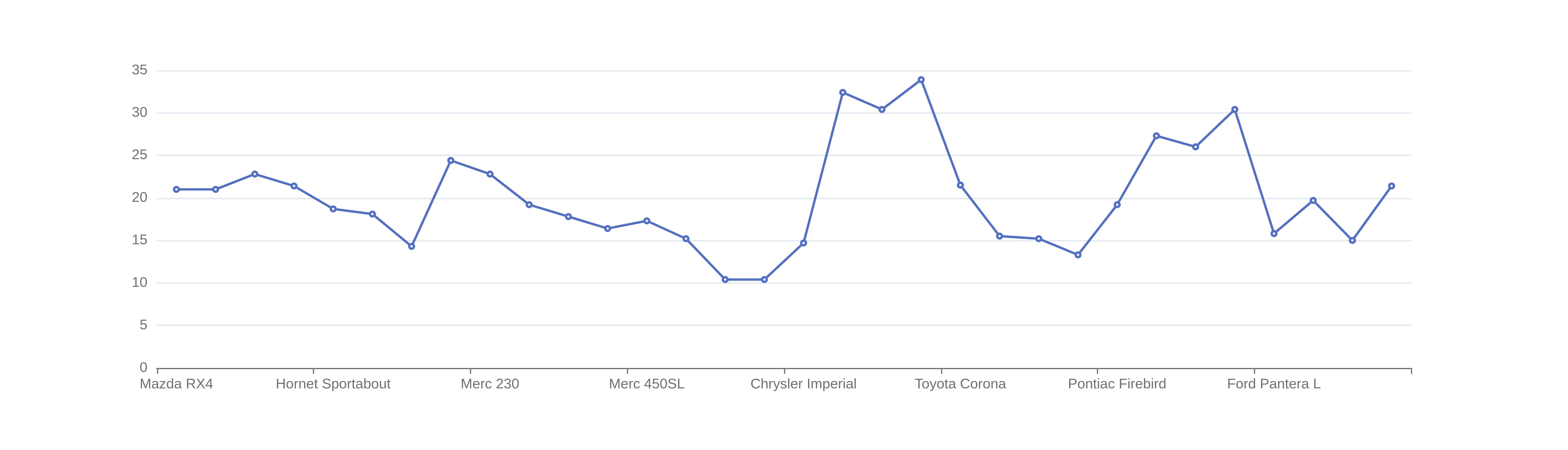
Line charts and spline charts can both be used to see the relationship between two numeric variables. A spline chart is useful when the relationship between the independent and dependent variables is smooth. Line charts are useful when the relationship between these variables is not smooth.
The line chart below shows the relationship between the car model and miles per gallon.
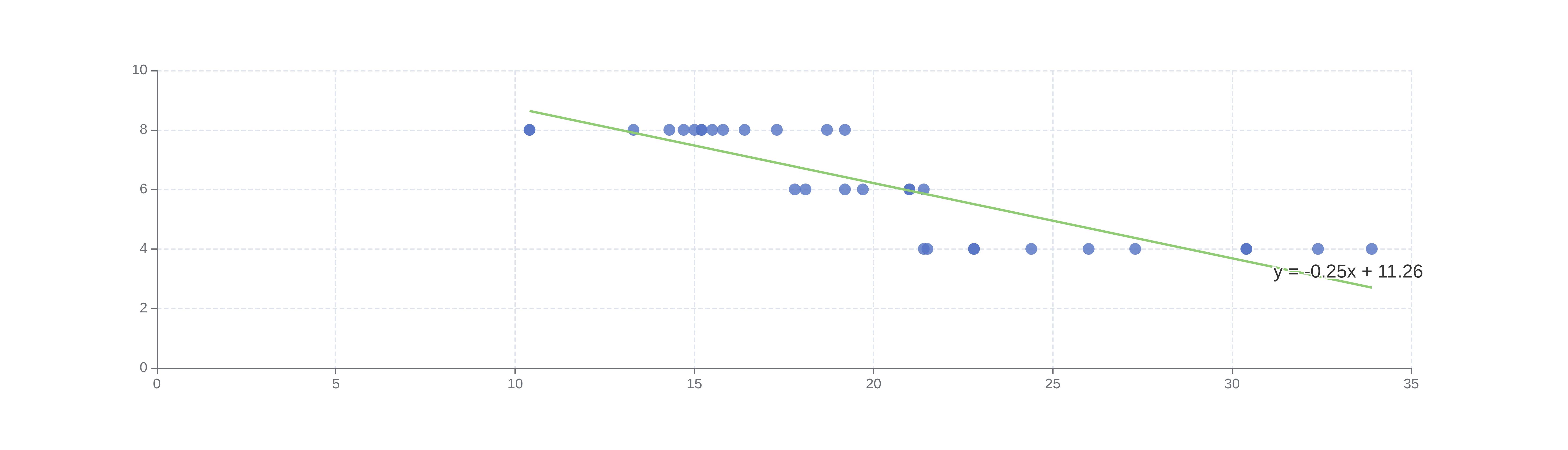
Regression analysis can be used to quantify the relationship between two variables.
The chart below shows a regression fit between miles per gallon on the x-axis and the number of cylinders on the y-axis.
How To Make a Spline Graph
Upload your dataset
Click the dataset input at the top of the page. Or drag and drop your dataset into the input box.
Pick a column for the horizontal x-axis
Choose a value for the horizontal x-axis that is not affected by the column that you will use on the vertical y-axis
Pick a column for the vertical y-axis
Choose a value for the vertical y-axis that is influenced by the values that you are using on the horizontal x-axis. This will make it easier to see how the column on the x-axis affects the values in the vertical y-axis.
Download graph
Click the download button on the graph to download an image of your spline graph