Sharing helps us build more free tools
Area spline graphs are similar to area graphs and spline graphs. They are useful for showing the relationship between two numeric variables.
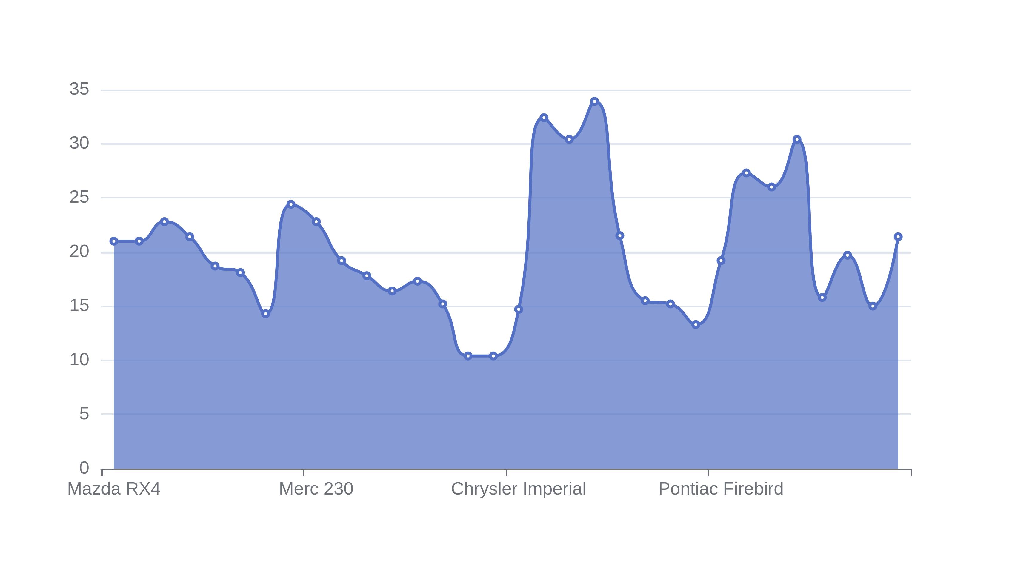
The area spline chart below shows the miles per gallon fuel efficiency of cars in the mt cars data set.
When To Use an Area Spline Graph
Area spline charts are useful when you want to show the relationship between two numeric variables that have a smooth relationship, and you need a solid fill under the line.
The solid fill can be useful for presentations, where some viewers may be a long way from your slide and might not be able to see a single line on a line graph.
Regression analysis can instead be used to quantify the relationship between two numeric variables.
Area Spline Charts Compared to Other Chart Types
Spline Area Charts are similar to spline charts and area charts.
Line charts use a straight line to join consecutive data points.
Spline charts are similar to line charts, but they smooth the lines between points.
Area charts are similar to line charts, but they have a solid fill under the line.
Area Spline Charts are similar to a spline chart, except they have a solid fill under the line.
How To Make an Area Spline Graph
Upload your data points
Use the upload section at the top of the page to upload your data table.
Select the column for the horizontal x-axis
Choose the independent variable for the x axis. The independent variable should not change because of the independent variable.
Select the column for the vertical y-axis
Choose the dependent variable for the vertical y-axis. The dependent variable should be influenced by the value of the independent x-axis
Download your area spline graph
Use the download button on the top right of the graph to download a png file